A Project by Equity Design ®
Client: We
Work: Branding, graphic design, illustrations and architecture
Branding/Graphic Design: Gu Sobral, Sérgio Magalhães
Architecture project: Rodrigo Ribeiro
We agency had greats moments in 2017. It’s finishing the year on the top 20 biggest agencies in Brazil and 4th best agency according to customer’s reviews in 2017. Equity Design was called to redesign all the agency’s branding, giving it a fresh new atmosphere to follow the great moment of growing the agency has been living.
The process was not so complicated because the whole concept was easy to find out. As one of the best agencies to work, creative people in the agency are so passionate about what they do. So the concept was made under the concept of love. We love things. So we represent this concept with a colorful elegant palette, a tiny facelift on the logo, an iconic heartbeat with the letter W and vibrant pulsating illustrations.
SporTV and Globosat Group
Project: SporTV Two-Page Press Advertising
Art Direction: Gu Sobral
Illustrations: Gu Sobral
Copyright: Julia Velo
SporTV is a very famous brazilian TV channel focused on sports and mainly soccer, owned by Globosat Group. I was invited to create a new press advertising press to help communicate four new TV shows in order to prospect new sponsors to them. That includes great presenters such as Milton Leite (narrator) and Roger Flores (ex-soccer player). I decided to make the entire ad in illustrations to make it fresh and cool, since the Globosat Group has been changing all of the visual identity to the same way on these last years.
Guarana Antarctica concepts. Composed by three key visuals in partnership with DM9DDB.
Single: It's Your Life
Role: Art Direction & Design for single cover
Art Direction, Illustrations and Design: Gu Sobral
Photos: Marcos Hermes
Client: Musickeria
Year: 2019
Zeeba is one of a kind artist. Writer, singer and composer of big hits spread worldwide such as "Hear me Now" and "Never Let Me Go" - in partnership with Alok - now he launches his new single featuring DJ Marina Diniz and singer Isadora, owner of the vocals of great hits such as Sun Goes Down's Bruno Martini. I was invited to develop the cover of this single. There is an exhausting process along the job before reaching the final result in order to communicate the right feeling of the song and also please all artists and people involved. The intention in this case is to bring a little bit of this process.
The whole process took two photo sessions to be accomplished. The studies above were made with photos from the first session. But then we've realised it would be necessary to take another round. And then we nailed it. I also gave an alternative option made one hundred percent with illustration, used on social media by the artists later.
After the final photo was solved, retouched and approved by all the artists, I finally gave life to the final cover. Somehow I had to put some dynamic feeling into it to represent the most different kind of lives. So I had the idea to play with many kind of different typographies. That worked pretty well on social media and also in static format for music platforms.
Besides the official cover, there is also a second version: this one is one-hundred-percent illustrated. The alternative cover was used to spread the song throughout artists' Instagram accounts, but unfortunately was not used on music platforms.
A Project by Equity Design®
DATE: nov. 2016
Client: Burger Break
Project Manager: Sergio Magalhaes
Branding & Art Direction: Gu Sobral
Illustrations: Gu Sobral
Architecture: Rodrigo Ribeiro
Burger Break is the new fast-food company founded in southern Brazil. Equity Design was called to create the branding and architecture. Establishments will be placed on highways and roads. Burgers on roads are almost like oases in the desert. A moment of relaxation and fun in the middle of tedious trips. It is from this premise that we create all the fun concept, architecture using containers in a perfect and non-conventional balance.
Project by Equity Design ®
Client: Q/Snack
Work: Branding, graphic design, illustrations and packaging
Branding/Graphic Design/Character Design: Gu Sobral, Lucas Aguiar
Architecture project: Rodrigo Ribeiro
Copywriter: Alê Garcia
3D Renders: Un Mariachi Studio
When it comes to quinoa, everything is impressive. It's called super food. Recommended by NASA. Considered best plant food for human consumption. The question is: if it is so complete, so healthy, so nutritious, what is really missing to be widely consumed? We came to the conclusion: the lack of taste. Or tastes. Thus we face the challenge of creating quinoa snacks with flavors to lick your fingers.
So yes, we did it. No gluten. No sugar. No lactose.
Agency: Artplan & Equity Design
Design/Creative Direction: Gu Sobral/Sergio Magalhaes/Zico Farina
Art Direction: Gu Sobral/Sergio Magalhaes
Illustration: Gu Sobral
Copyright: Marcos Abrucio
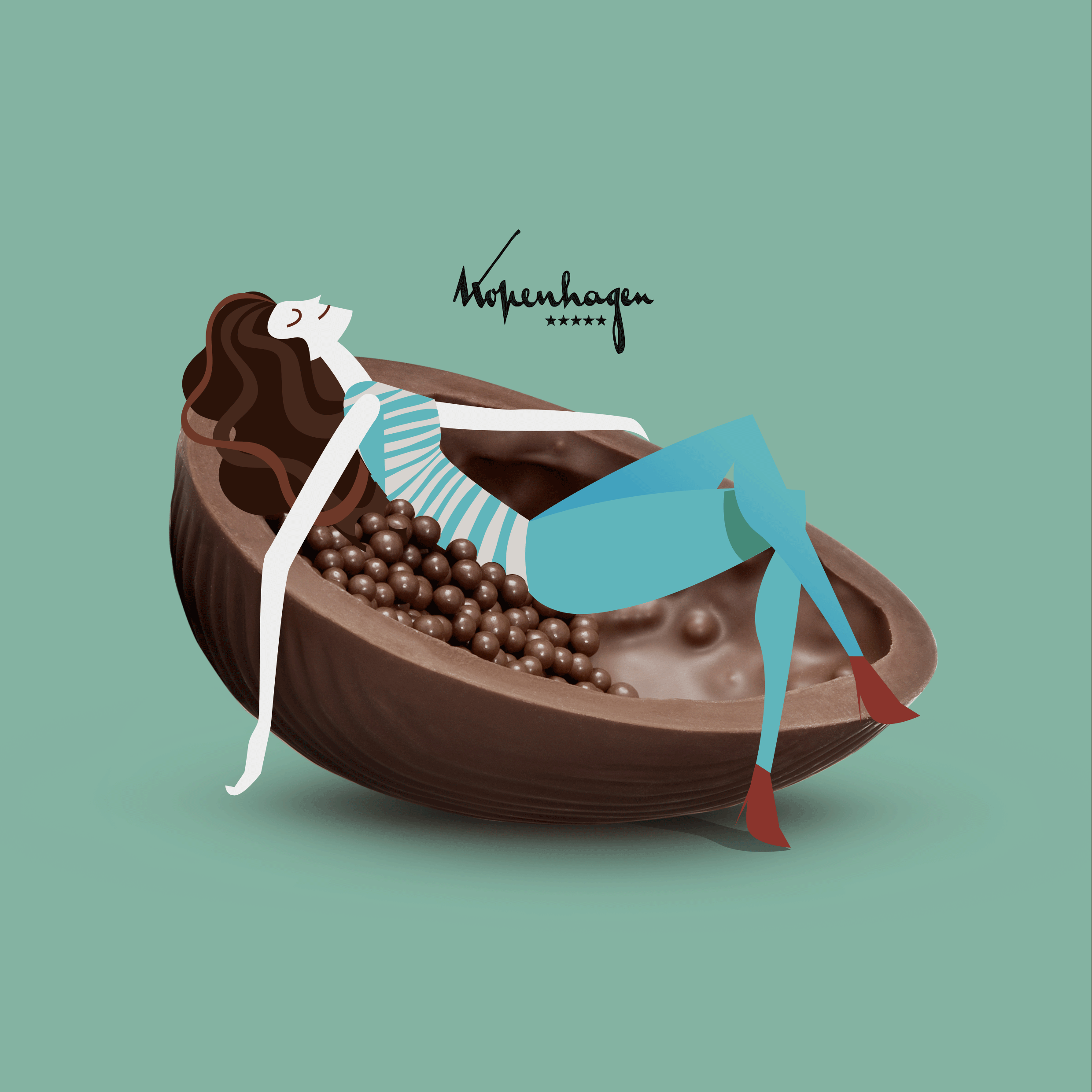
Kopenhagen is one of the largest chocolate chain stores in Brazil, with around 230 stores spread throughout the country. With the company's intention of changing the advertising agency, we were invited by Artplan São Paulo for a competition of the brand account.
After a month the presentation occurred, the agency Artplan conquered the account. And we did part of that with the project aside.
_
Conceptually, the agency has already brought us something they believed in, under the following concept:
"It's chocolate, but it's something else." So how could we translate this concept into something visual and powerful?
So we paid close attention to the shapes of the products so that we could transform into something entertaining and fun.
A Project by Equity Design ®
Client: Soulbox
Work: Branding, graphic design, illustrations and architecture
Branding/Graphic Design: Gu Sobral
Project Manager: Sergio Magalhaes
Architecture project: Rodrigo Ribeiro, Sergio Magalhaes
São Paulo is a huge and diversified city. A city that tends more and more to health and physical exercises. While some prefer outdoors activities, others prefer gyms. But this is the first gym in Sao Paulo focused on boxing and punching as a cardio exercise. And all the competition between the players is rated, measured and showed on screens all over the room. So all of this had to have a high-tech appeal, and we couldn’t make an aggressive concept, because this is all about shape your body and train your soul. We were called to develop all the concept, branding, atmosphere, graphic design and architecture of Soulbox.
Art Direction, Graphic Design & Illustrations: Gu Sobral
Creative Strategist: Carlos Cardinalli
In Jiu Jitsu the lack of unity is the real problem. And that is what the JJGF is here to change. A legendary athlete of Jiu Jitsu now as a mission: to make Jiu Jitsu the biggest martial art in the world. With this premisse, Rickson Gracie launched the Jiu Jitsu Global Federation.
I was invited to make the visual identity of the project and the key visual of the main campaign.
And after a couple months after the project is done, I was also called to redesign Rickson Gracie Cup® brand. The result of all this atmosphere is simply amazing.
Client: Blue Note São Paulo
Date: January 2019
Role: Graphic Design/Illustration
_
Originally from New York, one of the most classic jazz houses in the world is going to inaugurate one subsidiary in São Paulo, Brazil. Blue Note is a place plenty of history: consecrated artist been on that stage before, such as Herbie Hancock, Sarah Vaughn, Hermeto Pascoal and Stanley Jordan. So when I was invited to design 4 launching posters, that was really a honor and a great responsibility with all music lovers.
But not a responsibility with music lovers only. The house is going to be located in the most important avenue in the biggest city of Latin America: Paulista avenue. So I have to consider that having a Blue Note in São Paulo is such a gift for a city that is so rich culturally. And I couldn't just ignore the main postal card from the city.
So the big challenge was how to merge the jazz feeling with the architecture of the place.
A Project by Equity Design ®
Client: Niely Gold, in partnership with Artplan Rio.
Work: Branding, art direction and packaging
Niely Gold is a very popular hair product in Brazil. We were assigned to this project to get a new fresh look to their logo and packages. Also, we did some key visuals to launch these new assets.
A project by Equity Design®
Job Description: Branding, Graphic Design, Architecture
Branding, Graphic Design: Gu Sobral, Sergio Magalhaes
Architecture: Rodrigo Ribeiro
Client: Body Six Sense
Service: Gym/Sports
Date: February 2018
_
The Job
There is a new modality of super original gym in Spain. The academy that holds this new concept is Pavigym. They have internally developed a technology called Prama®. A successful entrepreneur wanted to bring this innovative technology to Brazil and make a new brand. Then, he called us.
_
And what is Prama?
With absolutely no treadmills or bikes, this new concept brings the gameplay and aesthetics of an arcade. It also tracks heart rate, times sprints and interacts with the player. It's fun and beautiful, because as you touch the circles and strokes, they light up.
Before you scroll down to see the project, just watch the video below to know more about Prama®. It's short. :)
Role: Illustration
Agency: DM9 (DDB Brazil)
Illustrations for fertiliser Biofert under the concept “Awaken the Beast”.
Role: Branding and Packaging
Health Grub has been around since 2006 offering San Diego’s best healthy gourmet meals delivery service. Health Grub’s mission is simple: to offer healthy meals at and affordable price and with the convenience of having it delivered to your door.
Endomarketing campaign for Hipercard.
The project included concept, character design, illustration and art direction.
A project by Equity Design ®
Role: Art direction and Illustrations
Copywriter: Ale Garcie
Project Manager: Sergio Magalhaes
In order to warm up sales for each season, we were called to develop a bunch of very cool bags for this Chocolate brand from Brazil. The result is fun and entertaining, and we were able to create something that people were happy to give as a gift.
A personal project
A reinterpretation of one of the most classic works by Machado de Assis, one of the greatest Brazilian writers. The story of the book takes place in the 19th century and the main character, already dead, tells the story of his life. Every detail of the illustration has an important significance of the major events of his life.
The main idea is to separate life and death in a horizontal line in the middle of the illustration.
Life above the line, a healthy body and things that gave meaning for his life.
Death below the line, a rotten body and things that he condemned during his life, such as religion.
Volkswagen - Which Rock is Yours?
Role: Illustration/Character design
Agency: Orange
Illustrations for Volkswagen’s hostile where you answer a quiz to find out what music profile most fits your personality. This campaign was made in partnership with Rock in Rio.
Equity Design® 2018
A project in partnership with Santa Clara agency
Job: Key visuals
Creative Direction: Sergio Magalhaes, Fernando Campos
Art Direction: Gu Sobral
Illustration: Gu Sobral
Copywriter: Fernando Campos
Photography: Zarella Neto
At the beginning of 2018, Equity Design was activated by the Santa Clara agency for a competition of the Boticário account, Brazil's largest perfumery network with more than 3200 stores spread throughout the country. Unfortunately we did not win the competition, but it is worth recording all the work done on this project.
__________
The concept. From alchemy to beauty.
The whole concept of the campaign was conceived around the "true self". When you find your own essence, everything flows better and you become more beautiful. And the task of finding its own essence, exposing its deeper nature is a long, difficult, and incredibly lonely process.
The good news is that there are magic stimuli that make you meet without so much effort and suffering. Smell, texture, color, praise. Looking in the mirror can connect you and your essence and produce an amazing result. We love this alchemy. We live by searching for elements of nature, mixing them in a special way, and combining that with their essence.
The result of the magic that begins in nature, passes through our hands and ends in you, we call beauty.
Equity Design 2017
Design direction: Sergio Magalhães/Gu Sobral
Illustration: Gu Sobral
Our goal was to do a consistent identity and packaging design for the Baruel baby repellent line.
The main idea was to do the whole project around characters who were "fly hunters", each of them in a specific way.
Unfortunately at the same time that we were doing the project, ANVISA (the regulatory agency for products and services in Brazil) decided that it could no longer use characters in products aimed at children under 2 years old.
So the products didn't reach the shelves with this design, but still counts as a beautiful childish project.
Illustration of Capital Inicial for Rolling Stone Brazil.
Print ads for Tam
Job: Illustration
Agency: DM9 (DDB Brazil)
Concept: Everybody has a reason to travel.
GRAACC + McDia Feliz
Role: Art direction and Illustrations
GRAACC is a reference in research about children’s cancer, always aiming at increasing cure rates. Every year, the institution consolidates a partnership with the Ronald McDonald Institute to reverse one day of McDonalds sales for GRAACC's children. Our mission was to tell this story through a fun instructional video.